


First thing first, I looked for trends or themes in the Bakery Industry that would point out a way to go.
These were some of the most relevant points I discovered.
From the beginning, it was clear that the bakery App or Web Store must prioritize and address health and dietary aspects.
The more primary and secondary research we did, the more evident it was.
It was conducted a Competitive Audit between four companies, two of them direct competitors also centered in San Francisco and the other two, indirect competitors.
I made sure to evaluate a broad spectrum of business sizes to get insights from every level. These were the evaluated business:

Competitive Audit Spreadsheet
These were some of our competitors’ strengths: Simple ordering process, slightly compatible with text readers, modern interface, big text, categorized items, reviews, wish list, filter by Vegetarian or Vegan, track your delivery, high-contrast text, and the ease of search items by typing, category, or filtering.
In summary, in terms of accessibility, even the best-positioned service wasn’t good. A basic function as a text reader wasn’t found in any service. In most cases not even external text readers like browser extensions would do the trick as they wouldn’t read the webpage following a logical order and they would throw up nonsense numbers and SEO labels mid-sentence.
After analyzing the results of the audit, and competitors’ strengths and weaknesses, we gathered a list of functions and features that our online service must address. Our goal was not just to match the capabilities of existing solutions, but to surpass them by addressing their limitations and shortcomings.
Design: Modern interface, fast and smooth, responsive, beautiful and accurate product images.
Features: Dietary options (vegetarian, vegan, and gluten-free), allergens list and filter, intuitive item searching (by text field, categories, filter, and scroll), track your delivery, detailed product descriptions.
Navigation: Elderly-friendly UI, add items to the cart without necessarily opening the product, consistent grid view, clear navigation buttons, no intrusive pop-ups.
Customization: By item (one by one), closed and open-ended questions.
Accessibility: Text to speech, high-contrast colors, big buttons.
After studying the industry and our competitors, it was time to meet our users. For that, we run interviews with the purpose of understanding users’ common obstacles when ordering online and what they expect from a perfect ordering service.
We interviewed 8 people. Instead of focusing on clients from Bredin Bakery, we expanded the sample group to cover the usual audience for Bakeries in San Francisco:
With the previous insight that accessibility aspects were being neglected, we decided to address them. That's why we chose 5 out of the 8 participants who had visual, hearing, or mobility impairments. This way, we're making sure to meet their needs effectively.
I resumed and gathered all answers in an Affinity diagram where it was easy to spot a lot of insights.

Affinity diagram
A big concern found between participants was the complexity of finding threads for people with specific requirements. For example, while Uber Eats would let you filter the results for vegetarian, vegan or gluten-free it was the only one with a feature like that, moreover, people with allergies would have to open every item one by one hoping to find a list of ingredients and checking that their allergen wasn’t listed.
To enhance the experience, we added a feature that lets you input your allergies or disliked ingredients. Then, the products containing those would be filtered out.
One of the most important insights revealed was the answer to the question “Should we design an App or a Webstore?”. According to the interviews, 62% of people prefer to use a general app or website like Uber Eats to order food online rather than one app for every restaurant/bakery they know.
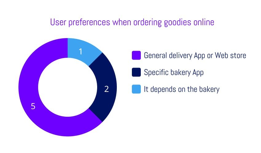
Graph of people who prefer to use a general service vs. a specific app to order online
Diving deep into this we found out that the concern was to download so many apps to cover one need. In order to avoid this resistance point, we decided to create a web store so our users could enjoy our product without downloading anything.
During the study, a third prominent theme emerged, identified through the experiences of two participants who had mobility disabilities. They highlighted the challenges they faced when interacting with designs that demanded precise tapping or swiping gestures.
In response to this issue and in order to enhance usability for all users, the web store's interface wouldn’t require swiping gestures and it would use big buttons to ensure a more user-friendly experience.
Combining the frequent answers from the interview, I started creating a profile that would represent our users.
 Aggregated empathy map
That immediately led to the building of our persona, Olivia, a woman that represents every user of us and whom we kept middle and centered during the process to solve all her needs when she wanted to treat herself with a glorious goodie.
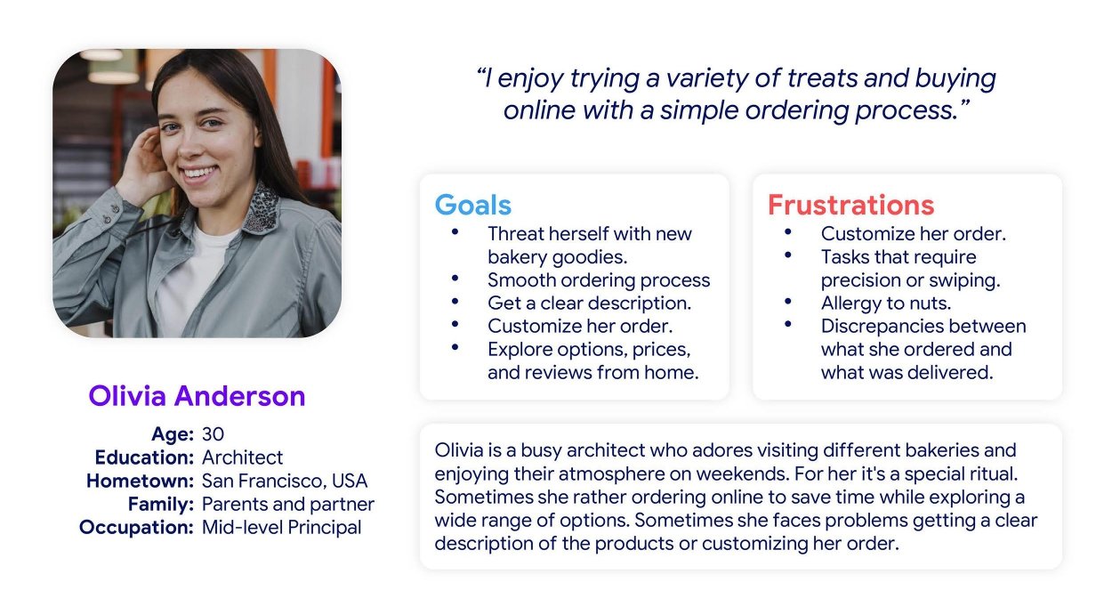
Olivia Anderson's goals, frustrations, and description
“As a busy professional and bakeries lover with an allergy, I want to easily delight myself by ordering new goodies online with a detailed description, so I explore new tastes, save time, and don’t worry about my allergy.”
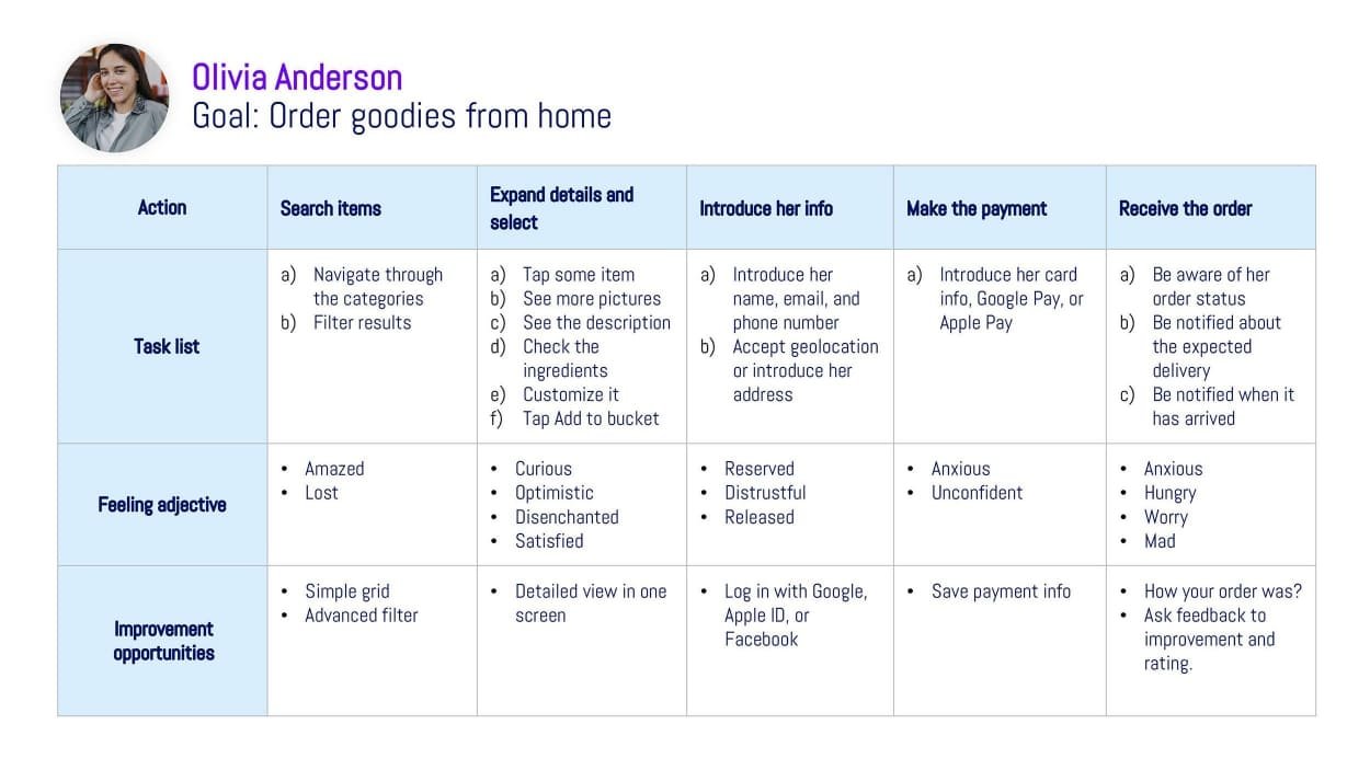
User journey map to the goal “Order goodies from home”
To not lose focus during the design, I summarized the info we had in a problem statement:
Olivia is a bakery lover with an allergy who needs a simple and safe way to order new healthy goodies online and customize them because she wants to explore new saviors, and don’t worry about her allergy or health.
Apart from the exquisite goodies’ quality, these were the characteristics of our online service that would make us unique and address all the needs no one was covering.
Simple navigation
Customization
Accessible to everyone
As we were trying to solve many problems, the goal statement, which usually is a single sentence, was represented in a table to understand it easier. The goal of this table was to keep focused on what matters along the project design.

Table about how each of the 6 problems would be addressed
Once we perfectly knew what to do and how to do it, I organized all functions and sections in their corresponding pages. The result was a simple linear path for our users to follow.
 Diagram of the sitemap
I started the creative process by quickly sketching several attempts for each page getting sure I would cover every section from the previous sitemap.

Quick paper sketches
After letting my ideas run, I then selected the variants of the sections that looked the most useful and started over.
Next, I made iterations of the rough ideas I preselected. This allowed me to continue exploring solutions without getting into a big commitment like a digital prototype.

Paper sketches iterations
Once I was satisfied with the ideas that came up while drawing, I moved the best ones to a digital wireframe that slowly evolved into a Low Fidelity Prototype.

The first digital view of the digital design
The Design was still far from being accurate but good enough to be understood without explanation, so this was the perfect time to run the first usability test.
The goal: Find out if it is necessary to iterate the design or flow to correct it now that it would be simple and inexpensive to do before continuing the design or development.
Expected result: To discover some friction points and feedback that lead us to improve the design.
This was a remote Moderated Usability Study run among 5 participants located in San Francisco that fit our target audience demographic information. Once again, we recruited 3 participants with impairments as we wanted to evaluate how well the design was working for them.
The key performance indicators used in this study were: Time on task, user error rates, drop-off rates, and system usability scale.
Seeing the performance of the participants and paying attention to their answers I found some themes that showed areas of the design that could be improved to give users the best possible experience. These are three of those findings.
A feeling of incomplete task after filtering results
With the idea of making the filter as simple as possible, I thought it would be a good idea for the result to automatically be filtered every time a filter was set instead of having to tap on a button to save the filter. It points out that 80% of users expected to tap on a button after setting their filters to make it work.
To meet their expectations I integrated the wanted button on the filter pop-up so users could be completely sure that it filtered the results after hitting it.
 Filter pop-up before and after Usability Test
Confusion on the Cart Page
If there is anything where users do not want to have confusion, that is the prices. We tried to make the cart as simple as possible, but we may have gone too far on the first try. When a user added to the cart 3 cupcakes of one dollar each, the cart page would simply display $3.
We were suspicious about the comprehension of it, so we paid special attention to it during the test, and we found out that users actually prefer to see more numbers in order to be sure about the total price.
The clearest way to slow this was the universal understood: item price times quantity equals total, like $1 x3 = $3. Clearly, after the experimentation, we also adapted that formula.
 Cart page before and after the Usability Test
Overloaded Thank you page
A third improvement after this Usability Test took place on the Thank You page. Initially, a progress line was added to show order processing and delivery time. However, combining it with other details like the confirmation number and addresses caused confusion.
To address this, the progress line was moved to a separate screen. This change allowed for the inclusion of two additional features inspired by other apps:
By implementing these adjustments, the "Thank You" page was streamlined. The progress line was isolated to reduce confusion, while the new map and countdown features aimed to enhance user confidence and comprehension of the delivery process.

Thank you page split into two screens after the Usability Test
Once the corrections were made, the design was leveled up to a High-Fidelity Prototype slowing exactly how the final web store would look like and… Hands-off!

Bredin Bakery online experience
Whether you step into our bakery or click your way through our virtual aisle, Bredin Bakery promises a modern, delectable experience that's as unique as San Francisco itself.
One of the Unique Value Propositions of Bredin Bakery is to cover the accessibility need that no one in the industry is covering. We implemented a set of features to give everyone an enjoyable experience:
Initially, we planned to implement a text reader on the web, but we then realized that text reader users prefer to use their own. Perhaps it is a native phone feature, an app, or a navigator extension... so we focus on designing the web store in a way that it would be easily interpreted by those apps. Also, images contain proper descriptions and there is no hidden text that would make the text reader say nonsense.
The website follows a cream color palette that passes Color Contrast Checker with flying colors making it easy for all users to read the text.

Background vs Text color with an outstanding 17.03 points on Contrast Checkers
As was expressed during the initial interviews, swiping gestures usually represent a difficulty for users with mobility impairment. That is why the website doesn't use them on either the desktop, tablet, or mobile version.
During interviews, was also mentioned that one of the most important aspects for users with mobility impairments was the button size as typing with precision could be hard. For this reason, we made all buttons wide, and all clickable items have a wide interactive area around them.
 Big buttons and navigation icons with a wide area surround them.
There have been comments on the extraordinary simplicity of the checkout, apart from being flattered, we have noticed that some users perceive the “Add New Card” form as distrustful, in part due to its simplicity.
The immediate next step is to add details such as a card animation, and security texts that make everyone more comfortable without destroying the simplicity that we have achieved.
 Preview of the “Add New Card” form
One step that users usually perceived as tedious is the “Create a new account” Where they have to fill out a quite long form. Also, one of the biggest concerns while delivering is to have the correct address. To fix both problems it was designed from the beginning a feature that would geolocate users (if they want) to automatically fill the address field with high precision.
Unfortunately, that feature hasn’t progressed beyond the prototype stage yet, but there are plans to implement it soon.
 Representation of the autolocation feature


