


First of all, I had an interview with the CEO and Project Manager to understand which were the problems the company was facing and focus on solving them instead of just creating a nice website.
There were too many variables and usually, salespeople had to bombard users with questions over the phone to figure out which services to offer.
Then, I interview members from the attention desk, technical support, and sales teams looking to understand the users' behavior to create a solution that would fulfill their needs.
These were some findings:
I analyzed competitors from Peru to learn from their approaches, avoid their mistakes, and look for a way to stand out from the competition.

Competitive Audit spreadsheet.
These were some of the negative points we spotted as themes across internet providers.
Having examined the company goals, users' concerns, and competitors' fails we wonder:
As Cable Red was iterating, we had to update its brand identity to match its modernism.
Its previous logo, designed in 2008, used trending details that back then made it look cool. Now, however, it looked outdated. The graphic designer took hands on it and after sketching, presentations, and iterations for two weeks… Cable Red had a new logo.
![]()
Cable Red logo before and after.
This new brand identity represents the modernism, yet simplicity of the brand, and it is optimized for the digital environment that the company is prioritizing right now.
We established the pages we would need to design to solve the users’ pain points and achieve the business goals. That way the entire team was on the same page, we could work in parallel, and nobody would lose focus on the process.

Diagram of the sitemap.
Due to budget constraints, the company wasn’t able to get involved in a project this size. So, I split the ambitious plan into two phases.
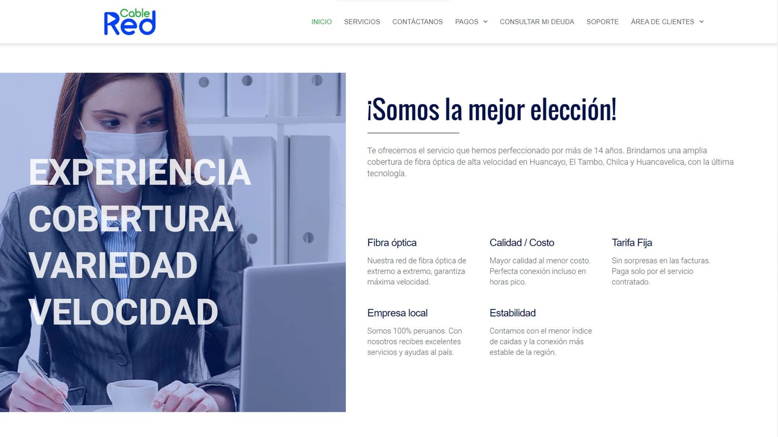
With the plan and identity, I then designed the home page as the next baby step. I presented it to the heads of Cable Red to check if I was going in the correct direction or to iterate at the point when it would be still easy to do it.
The first version of the Home Page.
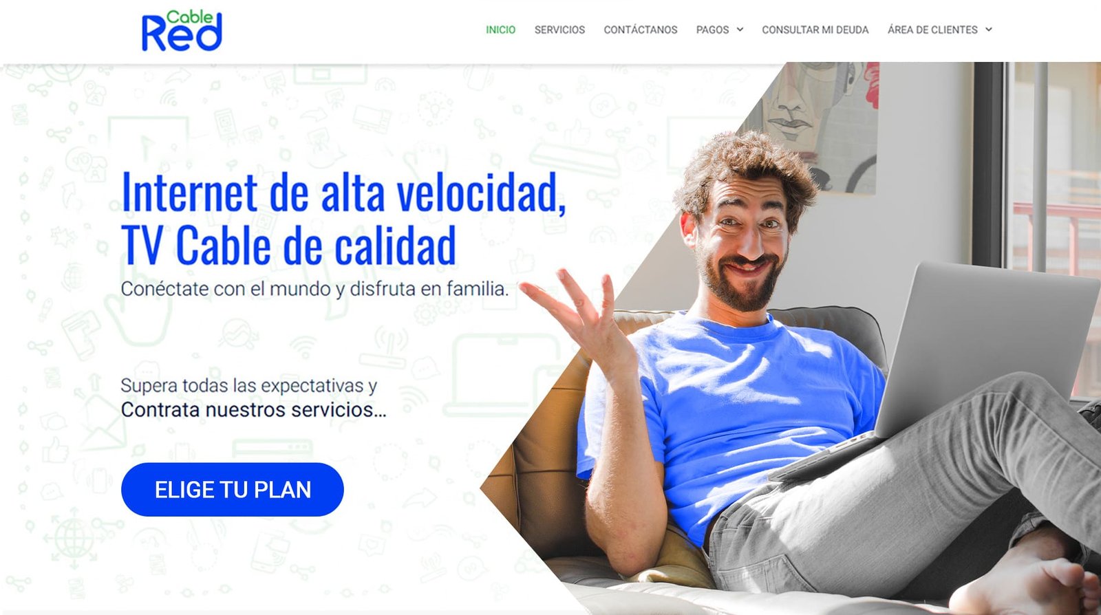
They offered me some valuable pieces of feedback that I used to correct the home page and kept in mind for the rest of the website, for instance:

Hero section after the feedback.
This illustration style and its animations immediately became part of the brand universe.
I continued designing the pages for Phase 1, which would allow Households, Businesses, and Hotels from different cities to compare, and easily solicit the services they wished.

User flow to request the installation of a service.
The website goes from macro to micro.
Initially, it asks the widest questions like your city and type of client, to display the services related to the users’ interests. This way the comparison and choice become simpler for the user.
Once the user selects the service, fills out a short form with information such as ID and address to make the installation. As a result, it considerably reduced the time the Cable Red team has to spend on this conversation over the phone and users could request a service installation at any time without visiting or phoning the office.
Shortly after, we noticed a shift: Users started to prefer online forms to request services, which were more efficient than phone calls. With this positive response from the audience, we moved to the second Phase.
Quickly after seeing the first benefits of a useful user-centric website, Cable Red gave the green light to implement the following features:
As those features would be just for clients, we created a Clients’ Area.
When a user makes a service request and it is installed, their account is created automatically. Therefore, users would not have to go through any trouble to configure their accounts themselves.
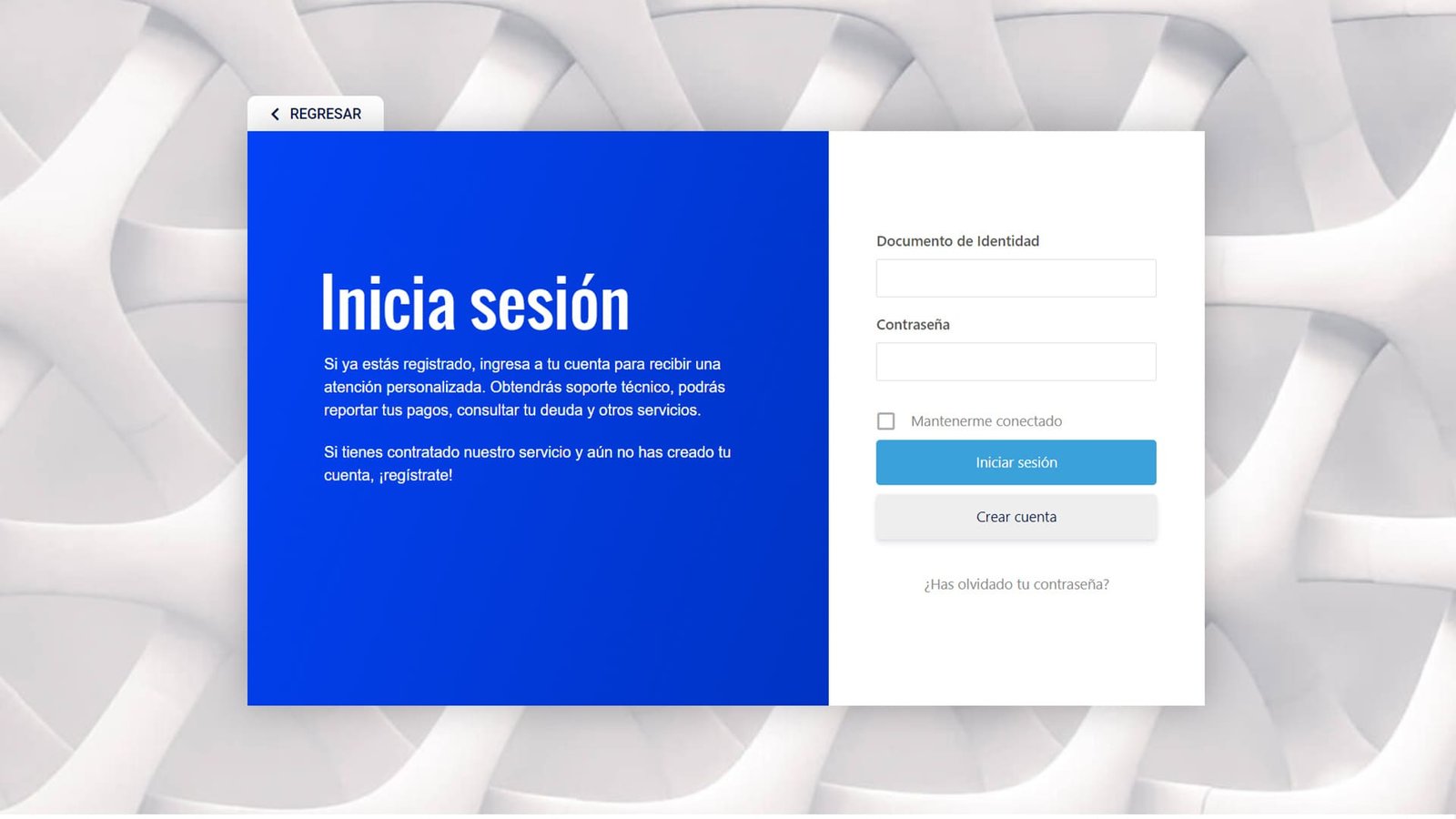
Log-in screen just for Clients.
The objective of this area was to remove the inconvenience for clients of visiting the offices. The two more impactful features were:
Report Payment:
Before, users had to visit the office every month during working hours to make payments. Now they can make deposits or bank transfers from anywhere, at any time and just send a receipt through the website. A feature that pleased clients and the attention desk team.
This made it possible for the company to keep receiving payments normally even during the COVID pandemic. Once it was allowed for clients again to visit the installations, they still would rather use the website.
Common Solutions:
We created a Frequently Asked Questions page to assist clients and reduce the number of calls the office used to receive. This gave clients a fast via of solving simple errors without the need to call an operator.
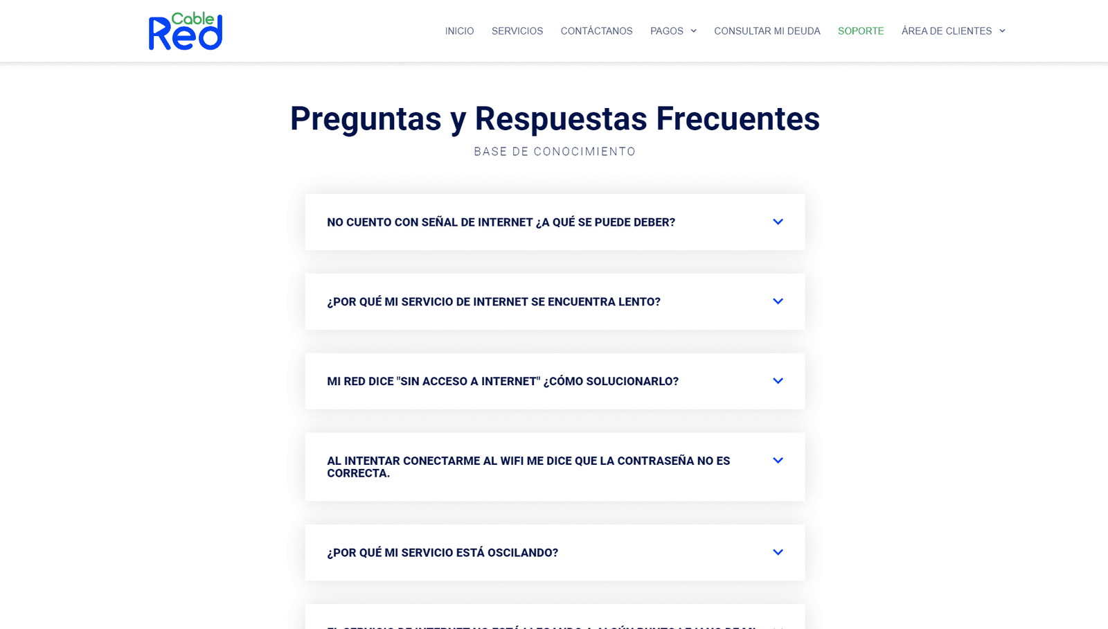
How it looks the Common Solutions page.
We announced the updates and within a few days, it was spotted a flow of users visiting the Common Solutions page. This indicated that users were turning to the website for the quickest solutions, the most cost-effective support… Win-Win.
Almost two years later, the geographical barriers that obliged Cable Red to offer different services depending on the region were surpassed. Now every city where it offers service receives the same TV channels, internet speed, and prices. This allowed us to significantly simplify the flow of requesting services.
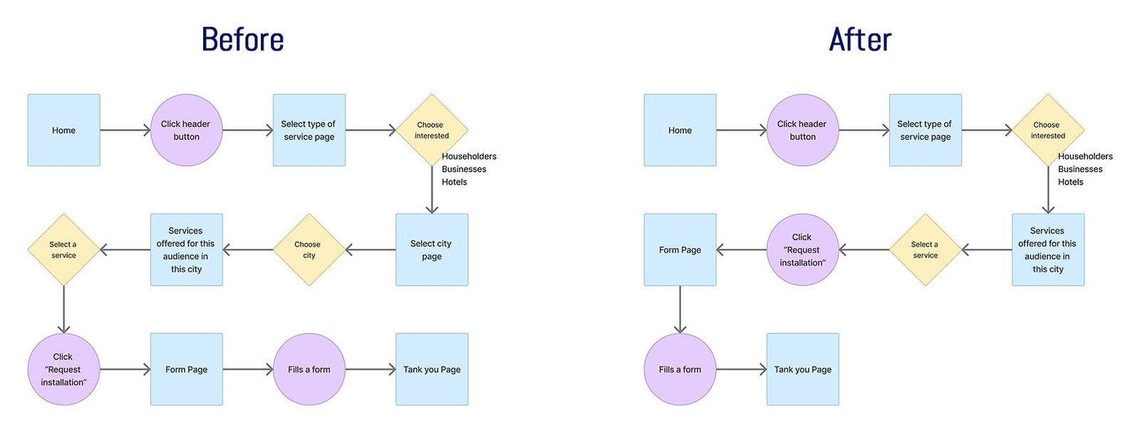
Request flow before and after standardizing the services.
On the website, users can compare plans and ask for installations by filling out a simple form that is more efficient for both parties than visiting or phoning the offices. The online service request is the favorite way for 32% of new clients to solicit Cable Red services.
Also, clients can manage payments and receive automatic support. That has freed up the attention desk by more than 20%. All in all, the goals were met.