


The process started by creating a fictional character based on competitors' marketing. By analyzing whom they were aiming at, we listed some of the common characteristics of fitness apps users.
Immediately after gathering enough data, we looked for 20 profiles that fit that demographic information and conducted interviews to know about their relationship with fitness apps, their habits when working out, their fears, and goals.
After the interviews and analyzing the information in an affinity diagram, were cleared spotted two groups with completely different motivations and goals.
These interviews revelated that a tight schedule was far from being the only factor limiting users from working out as initial assumptions made us believe. Other problems including being overcome by their work, bad timing to receive motivational messages, and even anxiety or difficulty to find new partners had made users quit from previous tries of getting fit or incorporating working out as a usual activity in their lifestyle.
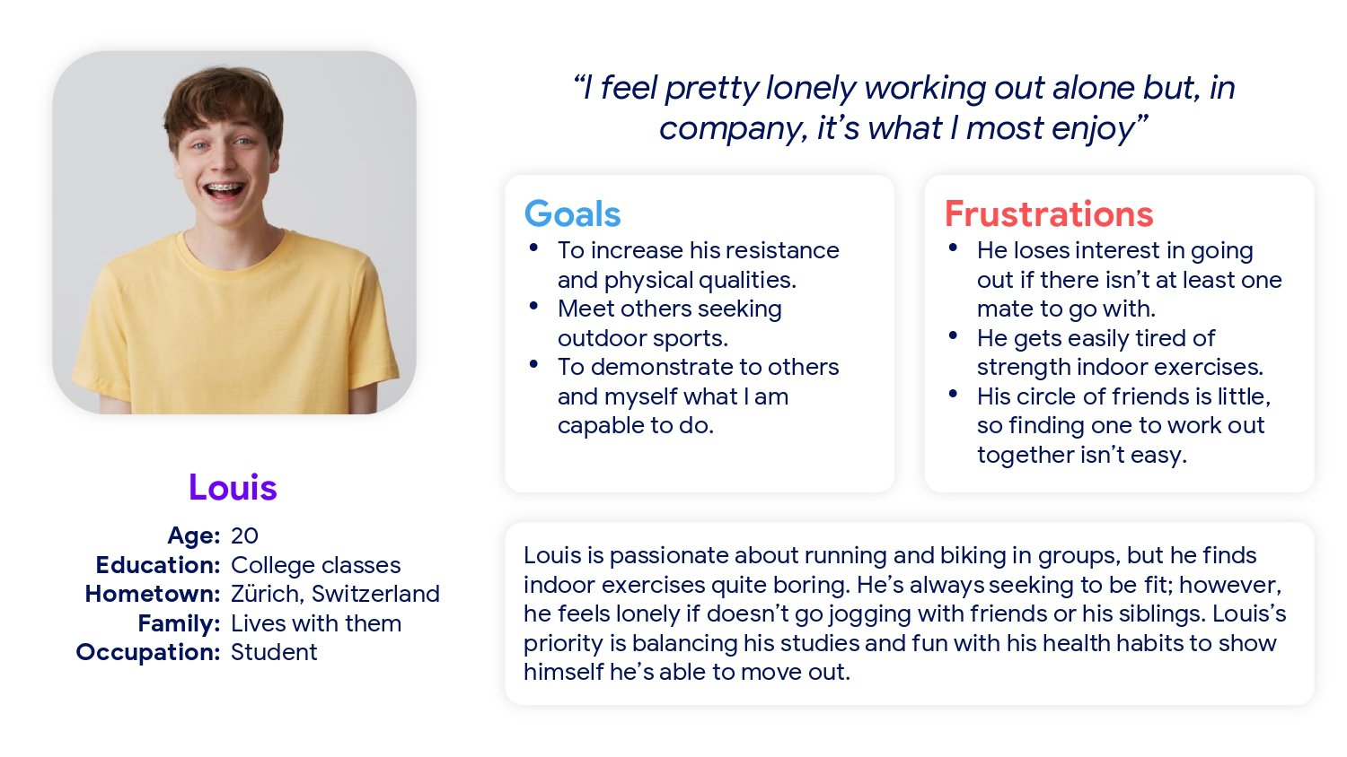
With that data, two personas were created: Zareen, representing the first group, and Louis, representing the second one.
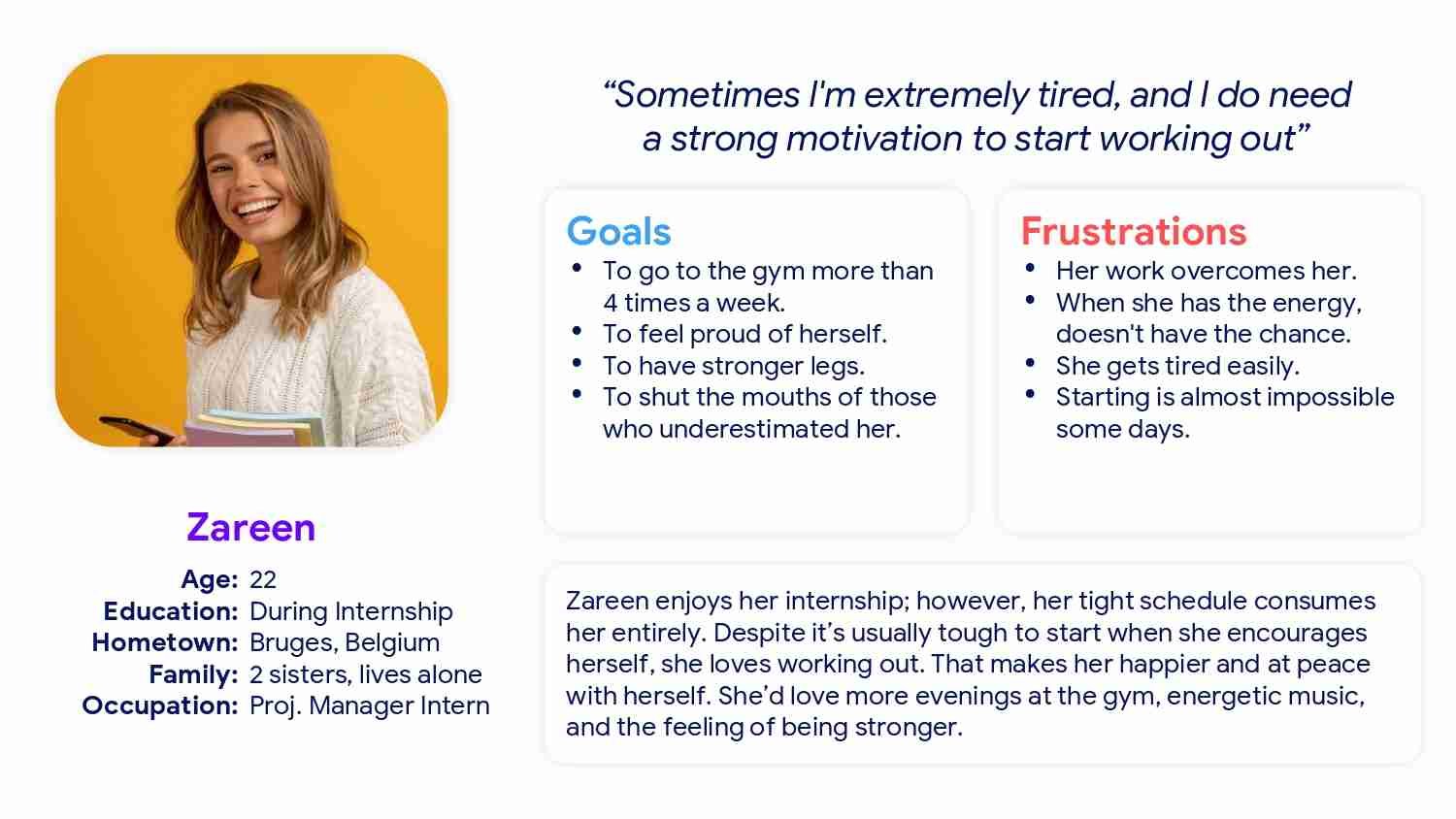
“As an intern who has a lot of work, I want to have an external huge motivation to take me up, so I would continue attending the gym.”
Zareen is a suffocated intern who needs some external strong motivation to start working out because it’s almost impossible some days.
“As a full-time online student who likes working out, I want to make new friends to practice together, so it’d be more interesting and fun.”
Louis is an online student whit a crying need for meeting active people to work out because he doesn’t like working out solo, it makes him feel alone.
We already had our hypothesis about how to solve our users’ frustrations but before starting the design we wanted to see how our direct and indirect competence was solving similar problems.
As we wanted to get information from a wide spectrum, I investigated 4 competitors at vastly distinct positions. Three of them were from the fitness industry and the last, was somehow related but from the healthy industry.
 Competitive Audit Spreadsheet
Apart from analyzing each competitor from the outside, I became an active user of each app for approximately 3 weeks to get a complete understanding of them. That was a part that I particularly enjoyed due to I love training and it was interesting to see how different were the solutions for the same problems.
I sketched several variants of each screen to find out the best solutions for each section before jumping to digital. This allowed me to explore many solutions in a matter of minutes.

Sketches of variants of the Home screen
Then, the best ideas were gathered and reorganized.
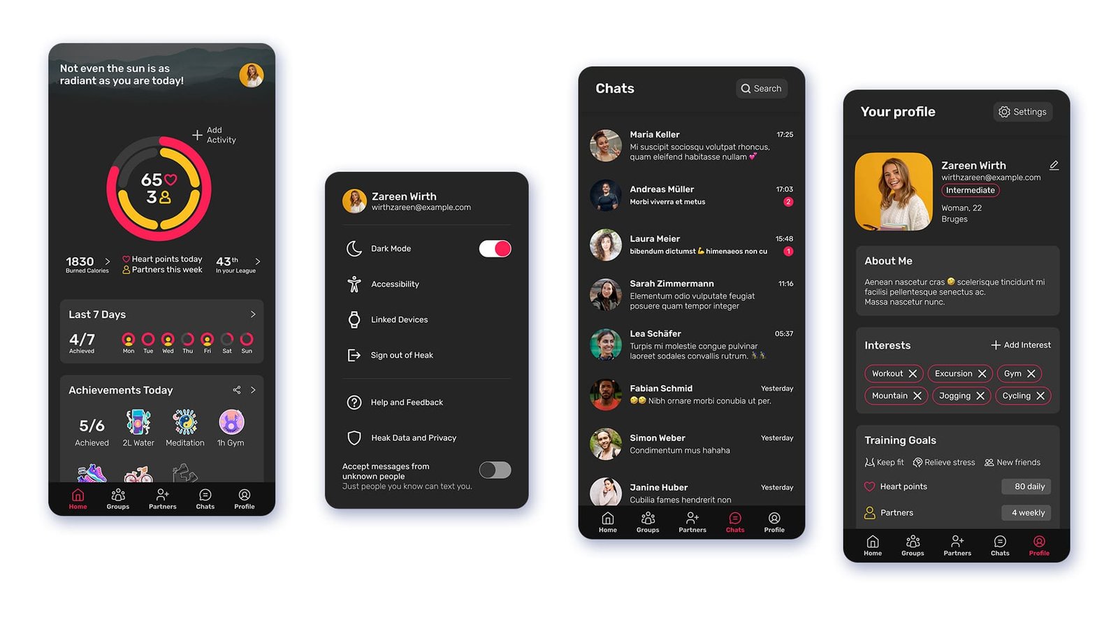
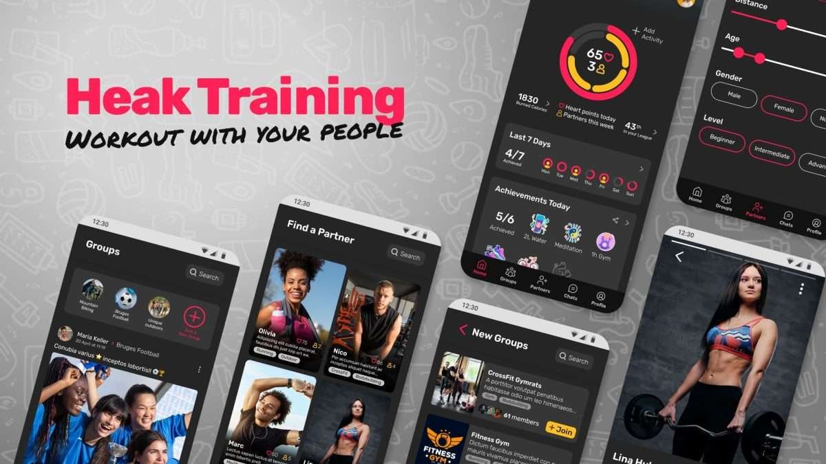
The goal of this home screen is to provide short and long-term motivation to our users, keeping in mind their different needs.
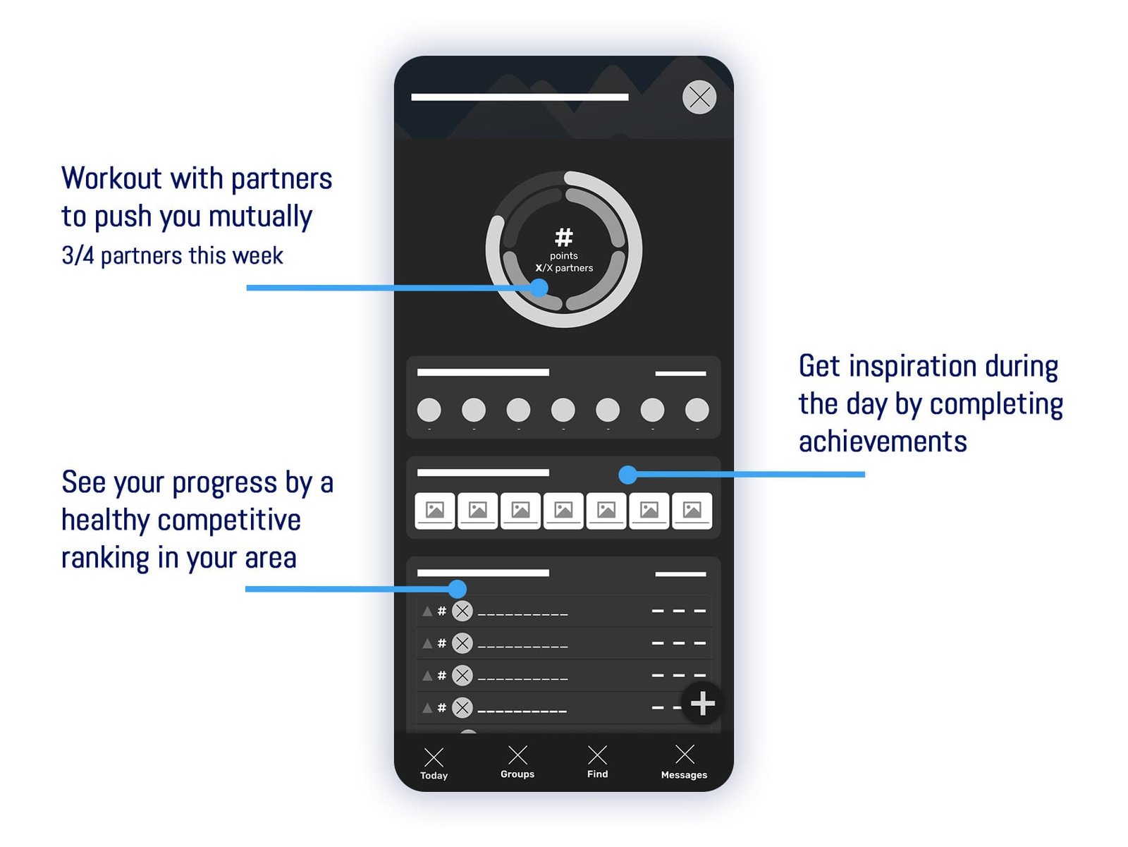 Home screen Digital Wireframe
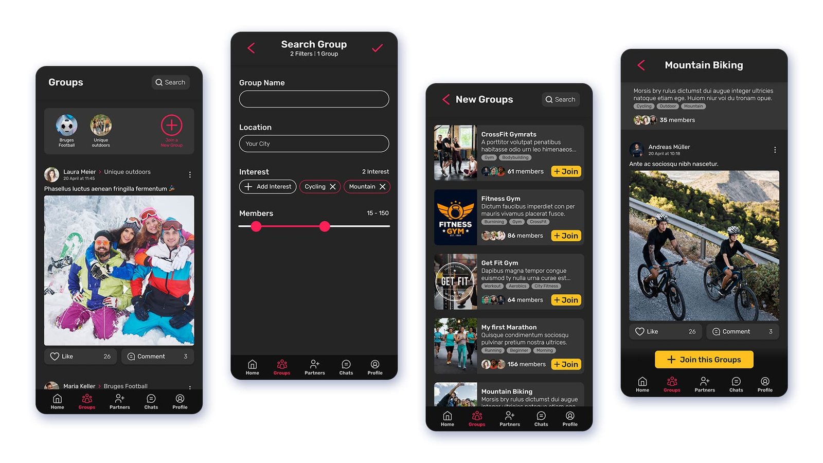
The feeling of pertinence and community was found vital for our users.
Users have the chance to join a group that shares their interests and meet with participants to practice together.
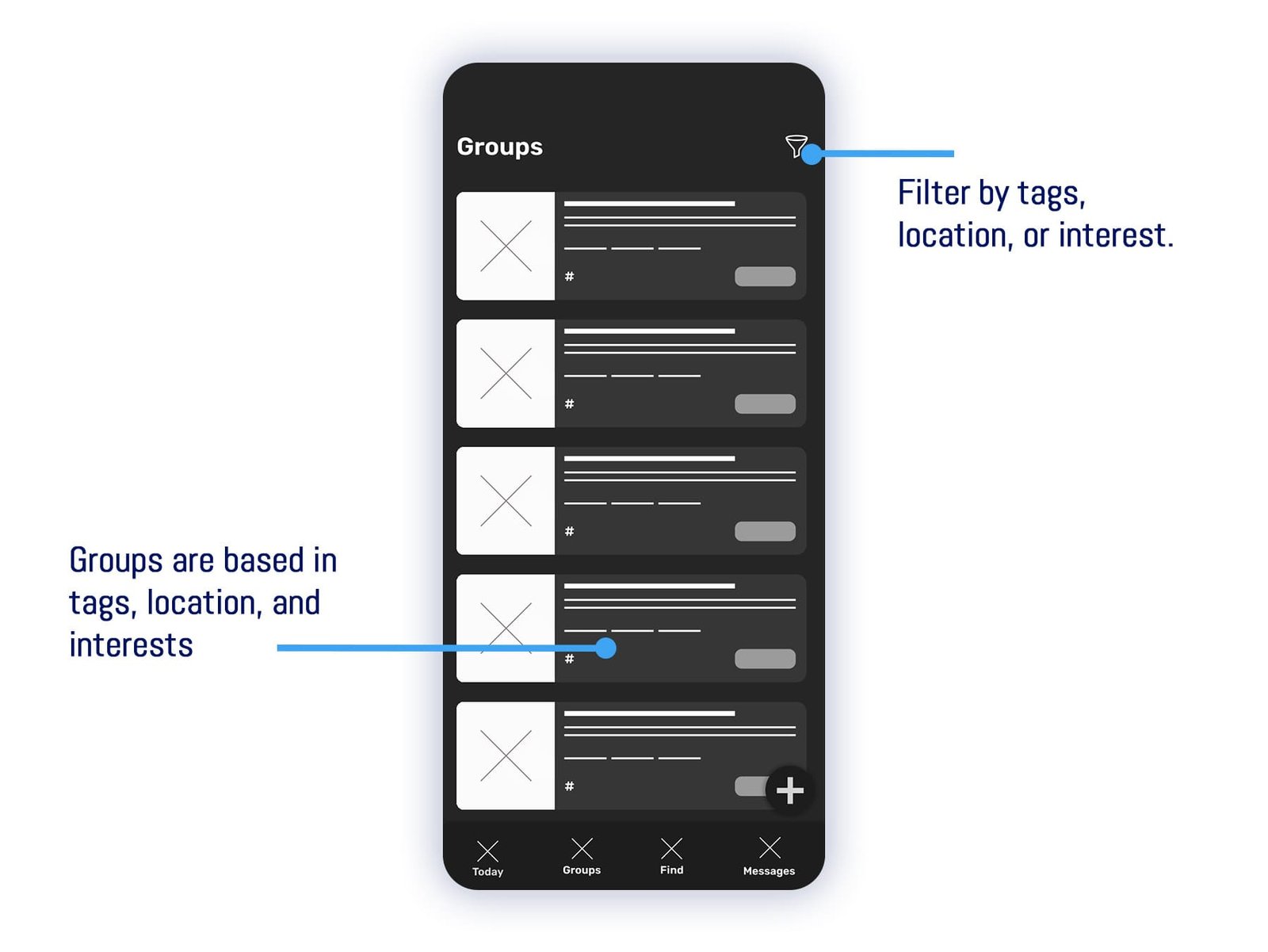 Groups screen Digital Wireframe
In the early stage of the design was conducted a usability test with a Low Fidelity Prototype among 5 participants.
After iterating the design with the previous findings and stepping up to a High-Fidelity Prototype, there was conducted a second usability test among other 5 participants.
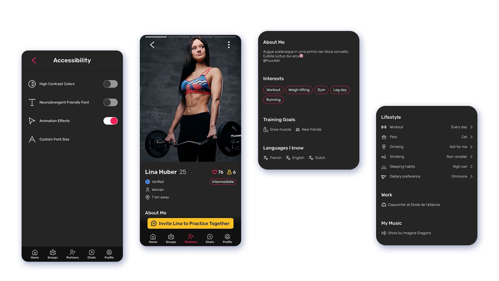
 Close-up of the achievements section with animated colorful icons
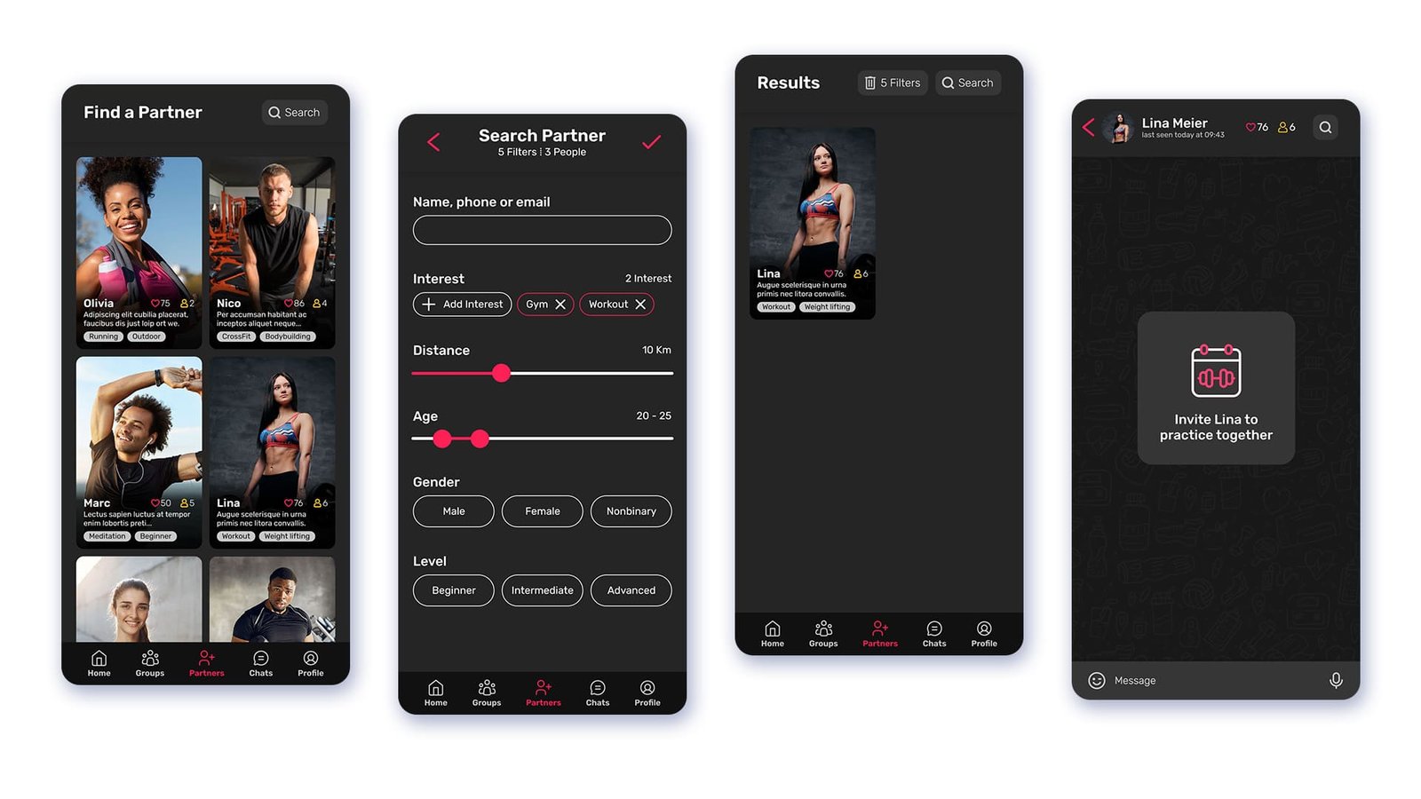
 Image of all the info you can find from a partner in their profile
The Home screen was rethought to be simplified while including more vital information in a more friendly way.
The Profile screen was added to the navigation bar to facilitate updates on it.
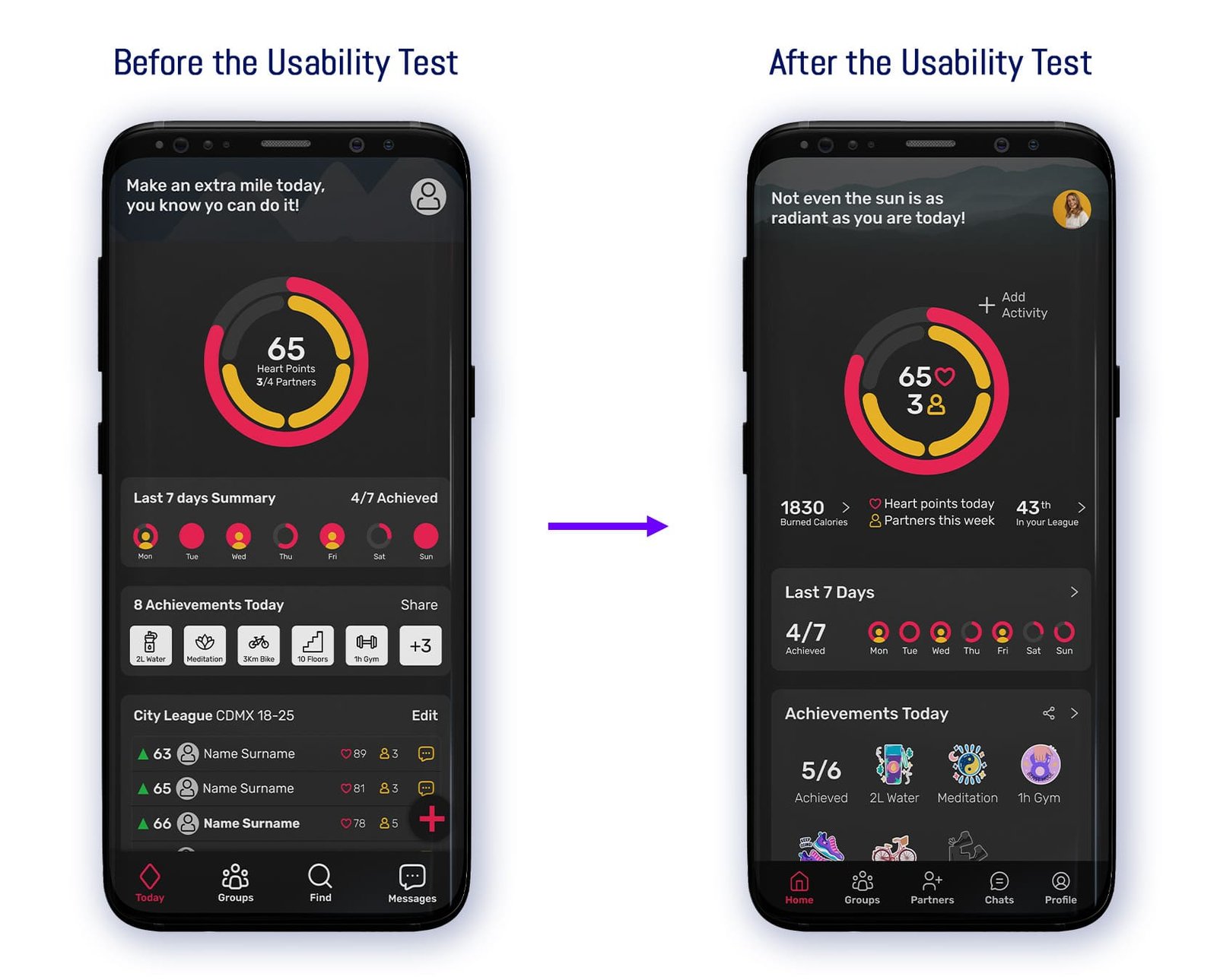 Home screen before and after the usability test
Was found that pictures had a crucial role when empathizing with people, so the “Find a Partner” screen was redesigned to give pictures more relevance while showing the same information.
 Find a Partner screen before and after the usability test
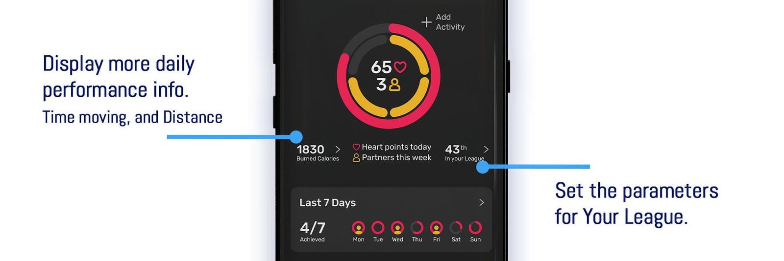
We believe that healthy competition is an important motivator, so we offer the optional feature of displaying the user's position in a local ranking. This is an optional feature as a comparison is sometimes the opposite of a motivator for some users.
The next step would be to give users the option to set the parameters for that comparison such as age, location, gender, and level so they could specify the group to be compared to and focus on being on the top of it.
Users from fitness apps are used to receive some basic info about their daily performance like Time moving and Distance. Until now our priority has been the motivational and community features keeping the app simple, however, showing that info could result in a smoother transition for users that want to give Heak Training a shoot.